Collapse
“Collapse” is a 4-6 person deathmatch and 2v2 team deathmatch map designed in Unreal Tournament 4
Quick Summary
Design Goals
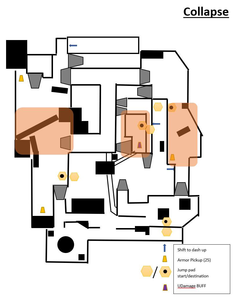
Develop 3 points of contention, each with clear sightlines to the power weapon of the map, the Rocket Launcher.
Create 3 lanes, separating the map into the 3 areas, each with a focus on controlling a specific weapon for team deathmatch.
Support for 2v2 Team Deathmatch, and 4-6 Deathmatch Free for All.
Develop a fast, high intensity player experience.
Development Facts
Engine: Unreal Tournament 4 Editor
Responsibilities: Design, blockout, gameplay implementation, aesthetic implementation, and lighting.
Development Time: 190 hours
Game Mode: First Person Shooter
My Design Process Overview
Create an intensity graph showcasing the intended player experience between spawn times and combat engagements.
Develop a paper design that showcases the 3 points of contention and the 3 lane design, featuring all health pack placements and spawn points ready for blockout.
Create a blockout and perform rapid iteration to get the feel and flow correctly adhering to the design goals.
With correct flow and initial playtesting to support, create a whitebox with all necessary elements (ammo, weapon placements, flow paths, health, armor) placed.
Swapping out Box Brushes with Art Assets and testing collision to make sure it adheres to the initial gameplay, or improves it.
Refining aesthetics and lighting, with heavy testing to make sure collision with new art assets is stable.
Screenshots Night
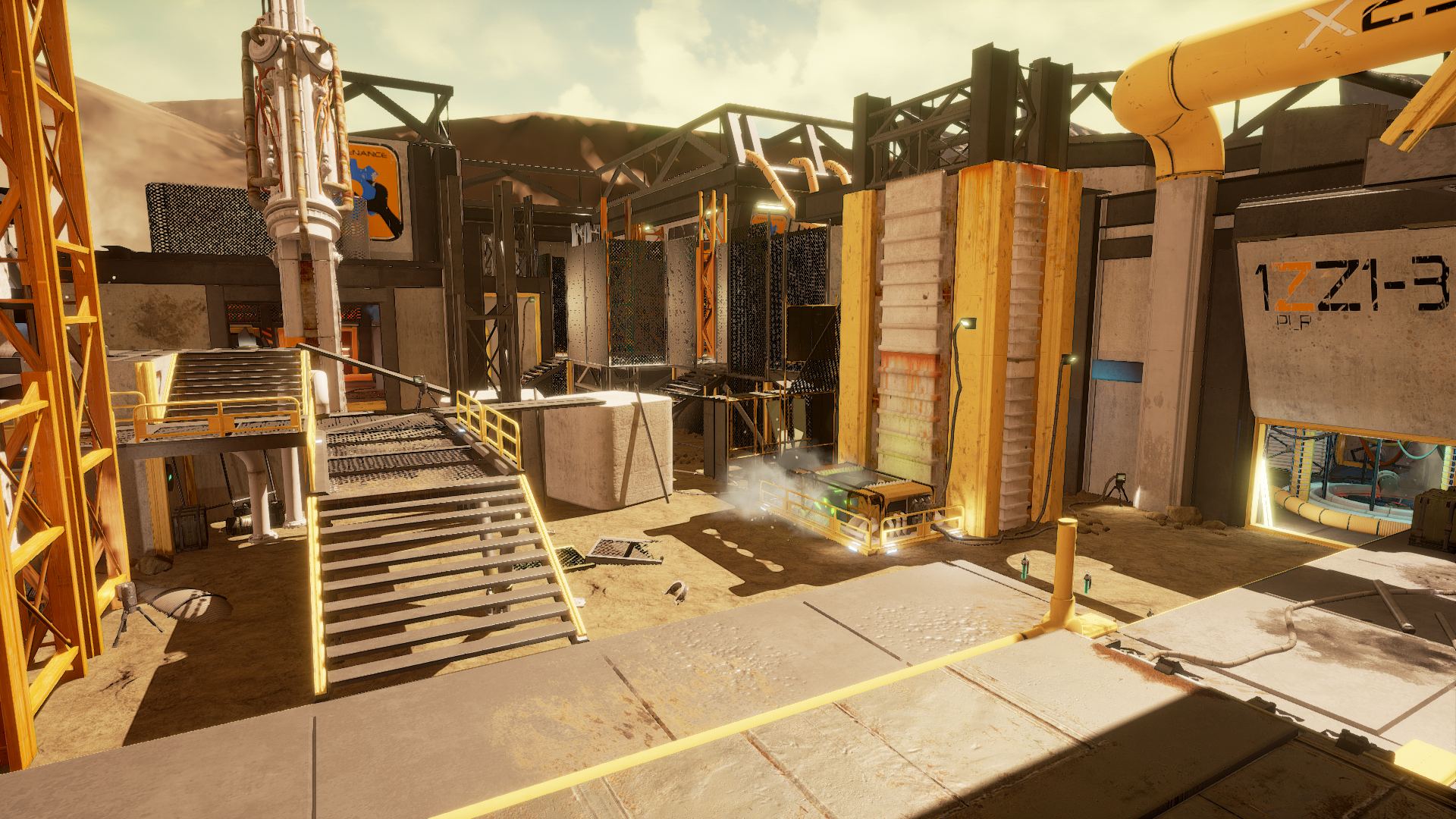
Screenshots Mid-Day
Video Playthrough Night
Video Playthrough Mid-Day
My Design Process
Developing the Player Experience
In order to develop the player experience, I started with the pacing of the map. The factors I discovered that allow for fast paced combat were Time, Playspace size, Lower cooldown between spawn and combat. By reducing the time of the match, players have to make the most of their spawns.
Time
Therefore, the first design decision I made was to reduce the match time from the standard 15 minutes to 8 minutes.
Playspace Size
By reducing the overall size of the map and really focusing on creating tight contention points with lower strafing options, the intensity increases. In order to support this design decision, tighter spaces will require more shotgun like weapons, in this case, the Flak Cannon.
Lower Cooldown Between Spawn and Combat
In traditional FPS multiplayer games, players have a cooldown when spawning along with a few seconds of extra time when maneuvering from spawn into combat. For this map design however, by reducing the playspace, there is a direct correlation to reduced cooldown between spawns and combat encounters. Because this map not only support standard deathmatch, but has a focus on 2v2 team deathmatch, allowing for lower cooldowns means players can meet up with their partners faster and support them.
Intensity Graph for Visualizing the Intended Player Experience
I created two graphs to better visualize the type of intensity and shortness of cooldown I wanted to develop the map for. The top graph demonstrates a typical FPS multiplayer cooldown between spawn and combat engagements, whereas the second graph shows the player experience and intensity I am designing for.
Map Design
When creating the map layout, I focused on making sure sightlines were available to the rocket launcher at all times. Along with the sightlines, I designed the map so that the rocket launcher was at the highest elevation. This design decision was to allow the verticality of the rocket launcher placement to not only aid in creating an advantageous spot for the weapon, but to also create a landmark that players can use when forming a mental map of the layout. In terms of verticality, there are 4-5 levels total, with minor verticality used to aid in vertical flow options and creating smaller circular flow options within certain areas of the map.
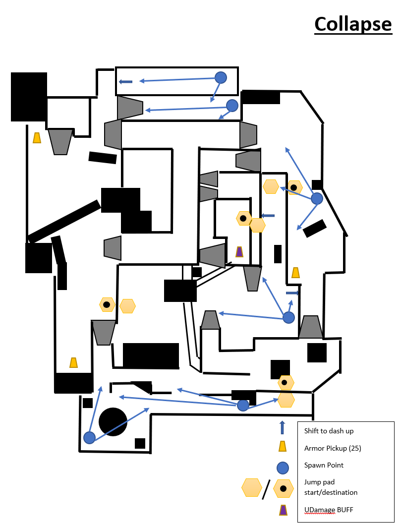
Due to the short cooldown I desired the map to have, I designed the weapon placements and spawn positions such that when players spawn, they were in view or close to in view of a weapon. That way players have an equal opportunity when coming out of a spawn to dive back into combat. This also tied directly into the fact that I designed the weapon placement to suit the area they were found in. That way, I can support the fast pace combat with reducing the cognitive load on players by having them not worry about having to actively seek out areas to use a certain weapon.
Once the map was blocked out, the scale was the major point of interest for me to get right early before gameplay implementation. The map went through a few revisions in size, with minor changes to the way cover was placed. With that completed, I moved into placing all necessary items for gameplay testing and am currently in testing phase.
(CLICK TO EXPAND) The maps are shown from left to right: General Map Overview, Spawn Point Flow, Points of Contention, and Sniper Lanes
Guiding Lines, Initial Lighting Pass, Vertical Slice Section
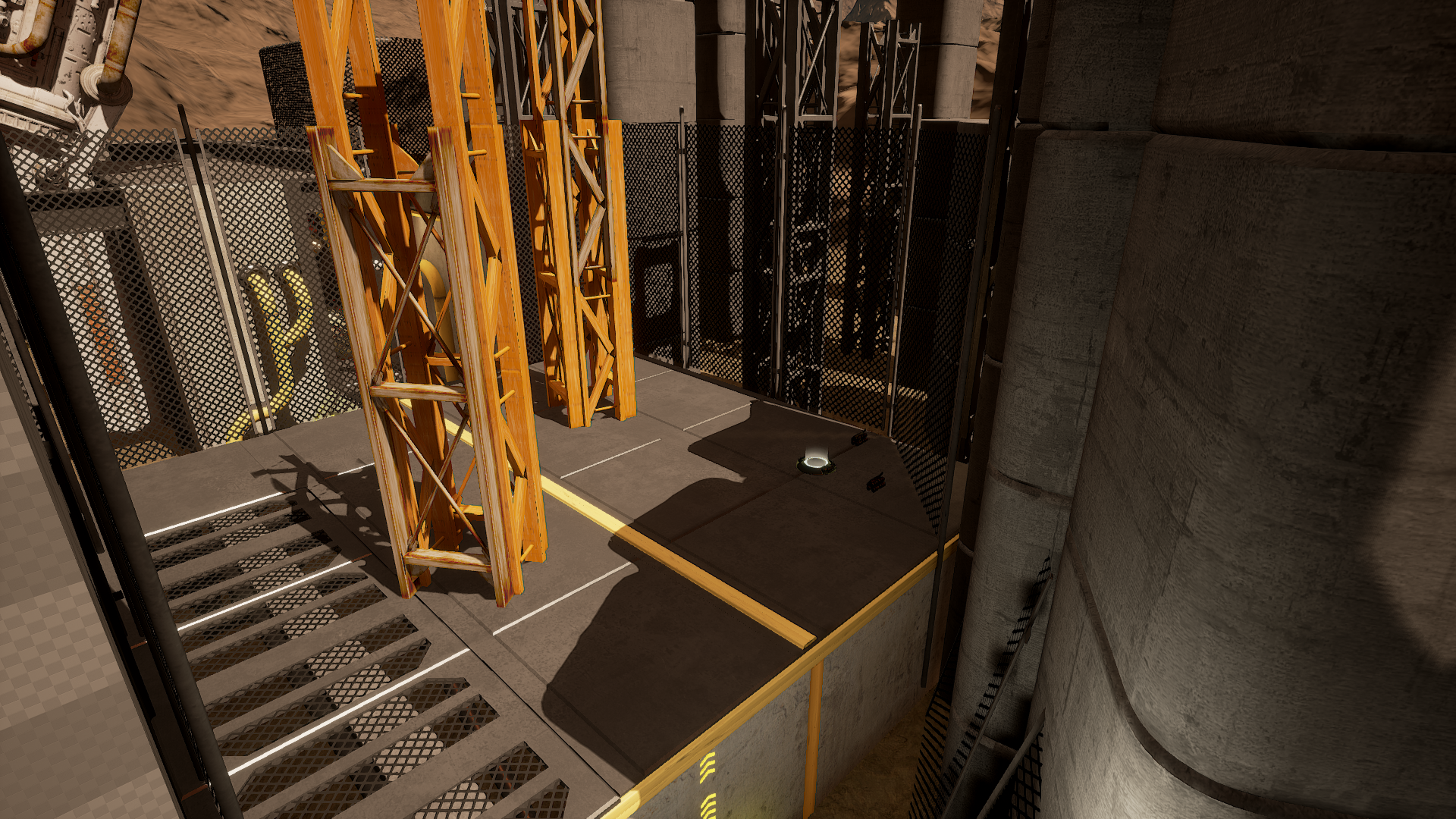
A big part leading into the Gameplay Complete milestone for this project was to implement large art assets (walls, floors, pipes, etc.) that could potentially impact the flow and collision from the Initial Gameplay milestone. This also proved to be a good time to mitigate risks regarding assets not having collision and utilizing blocking volumes to achieve the desired collision. Along with this, I began implementing art assets that had an impact on conveyance and guiding lines. For the aesthetic I wanted (Industrial Sci Fi), this meant having a contrasting color palette for conveyance items, health pickups, and other important gameplay elements to help them stand out from the bigger picture aesthetic of the level. The same principle was applied for the lighting. The use of contrasting color tones (cool to warm) are, and will be, used to pull the players attention and ultimately pull them through a playspace. In the following images, I have included the vertical slice section interior space, along with screenshots of the overall construction-like aesthetic of the bigger picture map. (Select the images below to see them in full screen view)
Vertical Slice Interior Space
Gameplay Complete: Large Aesthetics and Blocking Volume Testing
Gameplay Complete
This milestone functioned as collection of past milestones, namely the iterative process after Initial Gameplay, intermediate playtesting, and a large aesthetic and conveyance pass.
Aesthetics and Conveyance
The purpose of implementing large aesthetics was to define a common language between material usage and clutter. Because this is a fast paced FPS experience, the player needs to recognize obstacles and conveyance mechanisms fast without cognitive overload.
Another reason for the aesthetics was to implement all large centerpieces to test gameplay around and implement all walkable paths and walls. This way, collision can be tested and made sure as to not affect gameplay.
Blocking Volumes and Large Mesh Replacement
Before adding meshes into the level, I began by converting areas to blocking volumes. This way, collision from testing phases can be kept the same, and checked against meshes that don’t have collision. When adding pipes and sewer systems, the collision of the BSP was measured and then used to scale other meshes to fit the original collision parameters. This method/workflow ensured that all collision would retain the same.
Final Aesthetics: Small Asset Placement and Details
Small Asset Placement
The purpose of adding these small aesthetic elements was to really sell the idea of a construction site. Adding elements like broken clasps, screws, pipes, and wires created additional texture to the terrain of the map. Careful attention was put to not disturb gameplay (which is locked at this point in development). Another part of this was adding decals. The purpose of the decals was to further refine the aesthetic and deliver a dusty, muddy, and incomplete construction feel.
Details
Additional attention was put into fallen wires, cables, and other electrical components to make sure each light and each power source had a connection point. These details provide two things: They help sell the concept further, and they add additional conveyance. The position of the wires was intentionally placed to act as another layer of guiding lines. Along with this, to make sure each wire was aiding gameplay, they were constructed through the use of splines. This allowed for better control on the layout, as well as aesthetic.
Lighting
Lighting was a major part of this milestone for me. I really enjoy lighting environments, especially when it comes to using inspiring references. For this map, I wanted to impact gameplay and provide an extra form of replay value by implementing two separate lighting scenarios. The goal was to retain the layout and the gameplay that was already constructed, and have only the lighting differ. The purpose of this was to also explore how lighting impacts combat areas. Therefore, I lit the environment as both Mid-Day and Night. I found that in the Mid-Day version, players spent more time on the outside for combat, using the interiors as quick passage ways and alternate routes to break lines of sight. However, the Night variant had players spending more time engaging in combat in the interiors, and used the exteriors as high risk/high reward moments.
Mid-Day Lighting
For the Mid-Day variant, I used a yellowish hue for the sun (primary directional light) and supplemented that with a warmer white directional light in the opposite direction, which reduced the darkness of the shadows. I then used the skylight to bump the overall ambient light and as a result, keep the shadow colors from being too black.
Night Variant
The Night variant focused around deep blues and subtle shadows that are a direct contrast to the harsher shadows of the Mid-Day variant. While the Mid-Day focused on complementing the yellows and oranges of the overall aesthetic, this Night variant complemented the darker metal color tones of the steel beams and supports. The light sources that are present in the Mid-Day are the same as the Night, which means that no additional light sources are added for the Night variant. This was to help sell that the space and “world” is the same, just different times of day.


